

Photo by Luke Chesser on Unsplash
Exploratory Data Analysis using Data Visualization Techniques
Data Analysis on Steroids


Who doesn't like a good story?
Exploratory Data Analysis (alias EDA) is the story-teller. It's a process that is aimed at answering the question, "What does the data tell us?"
Data visualization is the movie. It translates the story into imagery, allowing the message to be spread with inclusivity (i.e., anyone can understand).
What's the point of Exploratory Data Analysis (alias EDA)?
EDA allows us to achieve the following:
Understand data
Do data cleaning
Identifying outliers
Identifying null values, invalid formats, erroneous values
Feature engineering (i.e., choosing variables/features with the highest impact on the target variable)
Uncover insights from the data (i.e., patterns that will help you formulate a hypothesis on the data)
To achieve the aforementioned, you will need the right tools.
Tools for EDA
There are many tools, but I will keep it simple.
Matplotlib: A versatile library that offers a wide range of data visualization options.
Seaborn: Built on top of Matplotlib, Seaborn simplifies complex visualizations.
Plotly: Known for interactive and web-based visualizations, Plotly is a favorite among data scientists.
Depending on the data and research question you will decide to go with one of the following types of EDA.
Types of EDA
To keep it simple, for each of the following types, there is a graphical and non-graphical variation, bringing the total to 6 (i.e., 2 x 3). We will focus on the graphical variations.
Univariate analysis: Identifies distribution and characteristics of individual variables in the dataset.
Example: A company wants to analyze the salaries of its employees to determine if there are any patterns or trends in the data. They use univariate analysis to summarize the data and look for patterns. They use frequency distribution tables, histograms, and box plots to visualize the data and identify any outliers. They find that the majority of employees fall within a certain salary range, and there are a few outliers with significantly higher salaries.
Bivariate analysis: Explores the relationship between two variables in the dataset.
Example: A researcher wants to study the relationship between precipitation and plant growth. They collect data on the amount of precipitation and the growth of plants in a certain area. They use bivariate analysis to determine if there is a relationship between the two variables. They use scatter plots and correlation matrices to visualize the data and identify any patterns. They find that there is a positive correlation between precipitation and plant growth, meaning that as precipitation increases, so does plant growth.
Multi-variate analysis: Explores the relationship among variables in the dataset (i.e., more than two variables).
Example: A marketing team wants to analyze the popularity of four advertisements on a website. They collect data on the click rates for each advertisement, broken down by gender and age group. They use multivariate analysis to determine if there are any patterns or relationships between the variables. They use network diagrams, treemaps, and bubble clouds to visualize the data and identify any complex patterns. They find that one advertisement is more popular among a certain age group, while another advertisement is more popular among a certain gender.
You will use the graphical variation when the dataset is small and non-graphical variations (like measures of central tendency) when you want to quickly establish relationships/patterns for variables on a large dataset.
Summary
Here is a list of the most common graphical techniques for each EDA type:
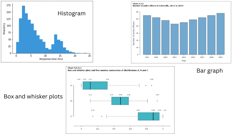
- Univariate Analysis Visualization Techniques:
Histograms
Bar Charts
Box and Whisker Plots
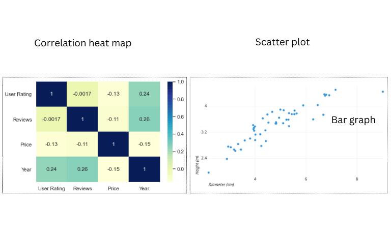
2. Bivariate Analysis Visualization Techniques:
Scatter Plots
Heat Maps
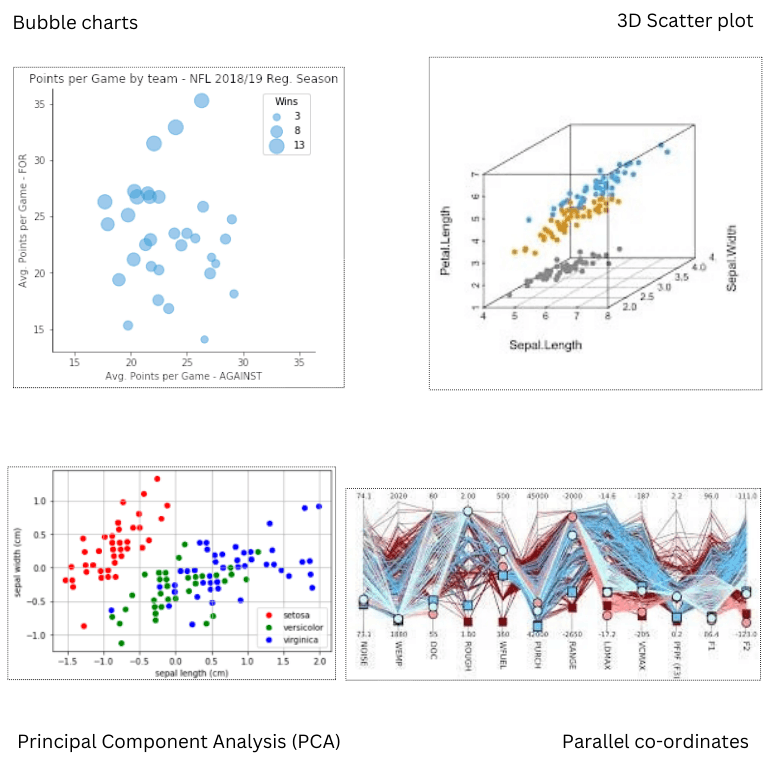
- Multivariate Analysis Visualization Techniques:
3D Scatter Plots
Bubble Charts
Parallel Coordinates
Principal Component Analysis (PCA)
Conclusion
In the captivating realm of data analysis, Exploratory Data Analysis (EDA) is the charismatic storyteller while data visualization morphs these tales into universally understandable visual spectacles. EDA's mission is profound, untangling, cleansing, and excavating invaluable insights from data, amplifying our comprehension and shaping data-driven decisions. Armed with the formidable trio of Matplotlib, Seaborn, and Plotly, we navigate the labyrinthine data landscape. The choice of EDA type depends on the data's personality and the questions we seek to answer, unveiling patterns and connections that guide our quest. In this data-driven odyssey, EDA and data visualization collaborate harmoniously to decode the data's cryptic messages, empowering us to pose the right questions and make judicious decisions, all while turning data exploration into an exciting narrative.
If you loved this piece, or otherwise, please like or comment.
Keep learning!